Sunday, 24 April 2011

Evaluation Q. 7

Q. Looking back at your preliminary task, what do you feel you have learnt in the progression from it to the full product?
A. I developed my skills at setting up photoshoots and deciding on image ideas to help pose and be prepared for photoshoots. I also learnt how to make the fonts match a bit more and be easier to read. I still didn't fill all of the space but I chose it to be that way instead of just not knowing what to put where or how. I put more on my final and put things like price, date, issue number, barcode and a main headline. My image on my final, I cut around whereas in my preliminary I didn't know how to do anything like that.

Evaluation Q. 6

Q. What have you learnt about technologies from teh process of constructing this product?
A.Things used to complete my product: InDesign, Photoshop, Canon Camera, And I attempted slideshare but that didn't work as it kept crashing my computer so Word Powerpoint was what I had to use.
I had tons of difficulties with technology while working on this. I couldnt upload things and the internet was moody for a while.
Working with InDesign was a very interesting experience as it enabled me to do tasks that would have been complicated quite simple really. Tasks like uploading a picture to the page and then putting colored text in a particular font over it. I used this for the majority of the magazine work. You can use layers on indesign which really helped to keep the layers of the magazine organized.


Using Photoshop was nice to be able to change things so easily from black and white and back to color and change the exposure and such. As well as cutting out Siobhan (main image) from the nasty background I ended up having her on for those images.  


I loved getting to use the macs that we were assigned to do our work. All of the programs were on here. They were a bit difficult to use at first because I had never used one. But once I got the hang of the basics (command key and what control does and doesnt do as well).


Whether no one could help me or people didn't have time, internet surfing made my project much easier and my product much more realistic. I had to use youtube, and google as well as blogspot to help find all the information on my magazine.

Evaluation Q. 5

Q. How did you attract/ address your audience?
A. I used feminine colors throughout and had a wide variety of images  as well as using the free poster on the front and listing the artists. By listing the artists they are bound to find a few they are interested in as well as look at how that's only some of the people included. For mode of address, I had Siobhan look at the camera for the cover image. The word "free" on the front makes the reader feel like they are getting more than their money's worth. The phrase 'indie sweetheart kickin casual' shows that the genre is indie as well as an indie sweetheart would be either a relaxed person and/or a beloved indie artits. Indie is supposed to be casual and not too done up so kicking back casual and relaxing is always a good thing audiences can relate to.

Evaluation Q. 4

Q.Who would be the audience for your media product?
A. The audience I chose was females between the ages of 15 and 25 mainly. Indie is a very broad music style that many different styles of artists fall under. I also tried to keep the clothing semi 'social-neutral' so that not just posh people could relate but your average everyday girl as well. Males would be able to get certain elements out of the magazine. I've got a festivals section and a reviews section so they COULD read the magazine but they wouldn't necessarily get it to it's full extent if they aren't interested in fashion as well as the interviews, especially this issue as the interview is Siobhan who is very feminine and quirky.

Evaluation Q. 3

Q. What kind of media institution might distribute your media product and why?
A. I would love to have my magazine have a website. The music and fashion industry change constantly so only having a magazine come out once a month or even weekly doesnt always seem to keep consumers up to date.
I would want Bauer to publish my magazine as he is a successful publisher in more than one genre of magazine including music/entertainment. I would want my magazine sold at easy to find stores like Tescos because they are everywhere across England and they have a section particularly for magazines so it would be easy to get them to sell the product I'm sure.

Evaluation Q. 2

Q. How does your media product represent particular social groups?
A. I tried to have males and females featured in my magazine that all had a variety of looks about them that your average person could associate themselves with. For instance, Charlotte Weaver (contents) was wearing Jack Wills which is considered a preppy brand name whereas Natalie Forsyth (contents) had more of a focus on her bleached blonde hair and teeshirt which was a more relaxed style for the more everyday person, but was still edgy (not everyone is comfortable with bleach blonde hair). The boy band I included (contents) had a mixture of dress style as well. Charlie was wearing trackies but there was a very expensive leather jacket as well so they were dressed from both sides of the spectrum. Some magazines (especially fashion ones) tend to only show expensive designer items that not everyone can afford or is interested in but I tried to show a variety of people from a variety of 'cliques' at school to help break up the social block.

Evaluation Q. 1

Q. In what ways does your media product use, develop or challenge forms and conventions of real media products?
A. Cover- My magazine cover doesnt follow your normal conventions of having a close up shot on the right side of the cover and then text/headlines of what's inside cramming up the left side.


 I have a full body shot and minimal text as I don't care for the cluttered messy look that is generally shown.

I found a magazine that does this that gave me inspiration but it is not the normal convention. I also didn't make my cover particularly gender neutral as the main colors were pinks and turquoise blues and purples which are stereotypically feminine colors and for music magazines there seemed to be a general neutral gender color scheme from magazine to magazine to add to the reader count. I followed conventions by finding many magazine covers I liked and taking elements from it to form my ideas. I didn't do anything drastic like move the masthead to the bottom of the page or anything.

Contents- My contents page followed most of the conventions of a normal contents page as far as I found. There were pictures and pages numbers and key words to draw your attention and help you find your way around as it is the 'magazine map' to help you get to what you want. I found that following the conventions of the contents page was best because it was the most easily read and most convenient/efficient way of fulfilling the purpose of a content page.

Double page spread- My double page spread also followed most of the conventions of a main image and then smaller images to support and Q&A interview text split up into columns. I found this was also efficient and easily read  and not to overpowering and busy.

Friday, 22 April 2011

Double Page Spread

For my double page spread I tried to stick with a very classic look like with my dps because I felt that most of the conventions were done that way because they work and look best. I considered adding an text box to the bottom half of the picture on the first page but I liked the image and didn't want to draw away from it when there was so much on the next page.


Monday, 18 April 2011

Conventions Of Double Page Spread

Generally the Image is on the left with the text on the right. The text is broken up into columns so that it's not massive paragraphs that look boring to read.


Avoid putting important bits of the image in the crack as the reader won't be able to see it clearly without ripping the page.

Tuesday, 12 April 2011

Double Page Moodboard

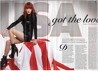
Double page spreads can be so creative or so classic. Either way is lovely!


This one seems almost backwards as the image is on the right instead of the left.


I love the one below. The image and the black and white are both nice and compliment nicely and the caption on the left page helps tie the text all together.


busy.


catching:

Sunday, 10 April 2011

Contents

For my contents page there are a few things that I needed to change. I needed to move the pictures and the live! up a tiny tiny bit to fill in that gap. It's easy enough to fix but it is an issue. Also, I was told that it was too busy but I thought it was rather effective as I tried to make things easy to find.