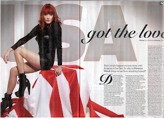
Generally the Image is on the left with the text on the right. The text is broken up into columns so that it's not massive paragraphs that look boring to read.
Avoid putting important bits of the image in the crack as the reader won't be able to see it clearly without ripping the page.

No comments:
Post a Comment