Monday, 28 February 2011

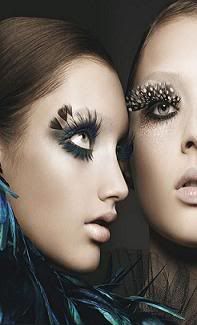
Fashion Photography Inspirations

The main reason I am interested in fashion magazine, is that I find their photography particularly nice. I'm taking a look at fashion photography to see if i can get some inspiration that might help me to decide what genre I would like to work under.


Could look at doing photos from across 'time'. This has a very glamour 60's/70's feel to it.
Contemplate if you want place included in your images or just a blank background such as the photography white screen.
 Black and white?

Lots of makeup? or minimalistic?? Crazy hair? not so crazy hair???

Friday, 25 February 2011

Front Cover Analysis 3


About Billboard:
The world's premier music publication, Billboard has served the entertainment business since 1894. Beginning as a weekly for the billposting and advertising business, Billboard and its popular music charts have evolved into the primary source of information on trends and innovation in music, serving music fans, artists, top executives, tour promoters, publishers, radio programmers, lawyers, retailers, digital entrepreneurs and many others.


In their masthead, they fill in some of the letters with color (different on each one).
Their image is generally well known people. And these wellknown people have a certain image they have which is generally something drastic.
On each, the artist's name is in larger font size than the others.
Each of the smaller texts are about well0known things (ex: itunes invades mexico, we all know and use itunes).

Front Cover Analysis 2


MF is a bimonthly publication that blends the best in independent music and fashion together in a new way. It pushes beyond your average fashion magazine and tries to go a dig a little deeper than the common music magazine.
The last image (blue background, white dress, blonde, red lipstick) is the one that got me interested in looking into this magazine. I found the colors very appealing and i liked the look of the magazine as it looked like it involved fashion (something I'm interested in including possibly in my magazine)
This magazine has a set style that they follow.
They have their own personalized 'mf' icon for their masthead. The 'mf' stands for music and fashion (which is said on the icon on the top right of the little circle around the mf).
There is a person on the front (either a music artist or related to fashion more).
Then in a list style is thee names of artists that are featured in the magazine.
There is a color scheme set for each issue.

Front Cover Analysis 1

The front cover is important because it's what would attract or fail to attract possible consumers.
In order for front covers to be successful they need to contain specific things.


About Indie Magazine: (found on their page)
INDIE Magazine is an international, independent style magazine with a focus on fashion, music and culture - founded 2003 in Vienna. Innovative fashion- and photo-editorials by internationally recognized photographers and portraits of budding talents from the fashion, music and cultural scene are INDIE Magazines cornerstones.

This is a magazine from the indie genre.
The thing about indie/contemporary/alternative/ ska music and the artist behind the music is that they want to appear and be different. This means that the artists on the front might not be well-known out of their genre (unlike people like lady gaga and beyonce that most people know of no matter what genre they listen to) Because they might not necessarily be well-known they need to either look somewhat shocking or quirky. The girl on this is very quirky with her glow-stick 'glasses' and her messy ponytail. She looks carefree with her light blue hoodie on as well She also fits the 'bohemian' look with her rainbow 'hippie headband. She also isn't wearing a large amount of makeup. This lack of large amounts of makeup fits the genre as they aim to either look very bohemian and natural or very fake and done up on the other end of the spectrum. Because this is not a well known artist and this magazine is also a fashion magazine as well, the name of the girl is not the third thing you notice. Instead you notice the "oh I see" in the right corner, which has to do with her.

The masthead is the first or second thing you notice (as with most magazines) It is white and bold so as to catch attention. It is also the second biggest thing on the page (largest text).

The cover follows the convention of having the text show importance by size.
This magazine breaks the convention of being very busy and having a load of text around.

The barcode is another element on a magazine. Some magazines put it on the back but its on the front left on this one.

Some other issues:

Saturday, 29 January 2011

Basic Magazine Terminology And Conventions

Terminology:
Cover: the front page 
Folio: page number, date, and name of the periodical on each page or spread.
Contents Page: the page that lists all the articles and features and their location
Gutter: the margin of the page at the point of binding, or the inside
page margin
Logo: the magazine’s nameplate,appearing on the cover, masthead, etc.
Masthead: the area, often boxed or given special typographic treatment, where the logo, staff listings, date of publication and other information regarding the publication is listed. The masthead of a magazine is very large and can be observed from a far distance.
Exclusive: story is promoted to the audience as only available in this magazine. selling point
Main story: the story generally about the person on the cover (which is what people are buying the magazine for so very important story)
Puffs coverline: summaries of the most enticing features and articles which are inside a magazine. on the cover, somewhat like headlines 
Direct mode of address: when the dominant image of a magazine looks towards the audience
Conventions:
Image dominates the page. This attracts the customer. They should be able to straight away realize who the celebrity/artist is and this helps sell the magazine. Customers are attracted by their roll models, someone they admire, or someone they find talented and attractive. If there is a woman on the cover, this does not mean that the target audience is women. Men's magazines generally have women all throughout.
Colors are used to portray certain messages or moods and themes. They also help to tell the audience whether the magazine is aimed at males or females. If the page/text is predominantly pink it is likely that the magazine is made for females (pink is stereotypically a feminine color whereas blue is generally stereotypically a male color).

Tuesday, 25 January 2011

genres

Out of all of the music genres, I chose the ones that I know anything about really and took a look at different covers for different magazines for each music genre. 

Alternative--


hip hop--


rock--


Pop/rock--


 pop--


jazz--


ska/indie--


Basic Market Research

I did a bit of basic research on the music magazine industry. I started by trying to find what the top music magazines in the UK are. To try to find what magazines are the most popular I looked for circulation numbers.

Below are some 2009 UK circulation numbers. Figures and information found at:

http://www.bauermedia.co.uk/Press-Office/News/ABC-Circulation-Figures-January-June-2009/

Empire: 194,016.
Predominantly a film magazine but has music in it, leads market as a top contender
Q: 100,172
UK's biggest selling music monthly
Mojo: 97,722
Uk's second highest selling music monthly
KERRANG!: 43,353
UK’s best-selling music weekly

I researched into the publishers of the magazines. Bauer was a name that appeared more than once. Here's the like to Bauer's website as well as some information from the 'about' page and 'home' page:

Bauer
Bauer Media is a division of the Bauer Media Group, Europe’s largest privately owned publishing Group. The Group is a worldwide media empire offering over 300 magazines in 15 countries, as well as online, TV and radio stations.
The Bauer Publishing Group was founded in Hamburg in 1875 by Johann Bauer. They have an annual turnover of 1.79 billion Euros.

All of the above listed top-selling magazines are published by Bauer. Bauer Media owns more than eighty influential media brands spanning a wide range of interests. The listed magazines are all listed under "Men's Entertainment". Gossip magazines like 'Heat' and 'Closer' are listed as "Womens Entertainment". Bauer Media reaches over nineteen million UK adults across multiple media channels.